It might seem that printed products, like labels, come either in black & white or color. But it’s much more complicated than that, and boils down to this question: what kind of color?
The colors that print out on the page (or product) can be spot or 4-color process (as opposed to “screen colors” that you would see on a computer monitor). So what does all this jargon mean?
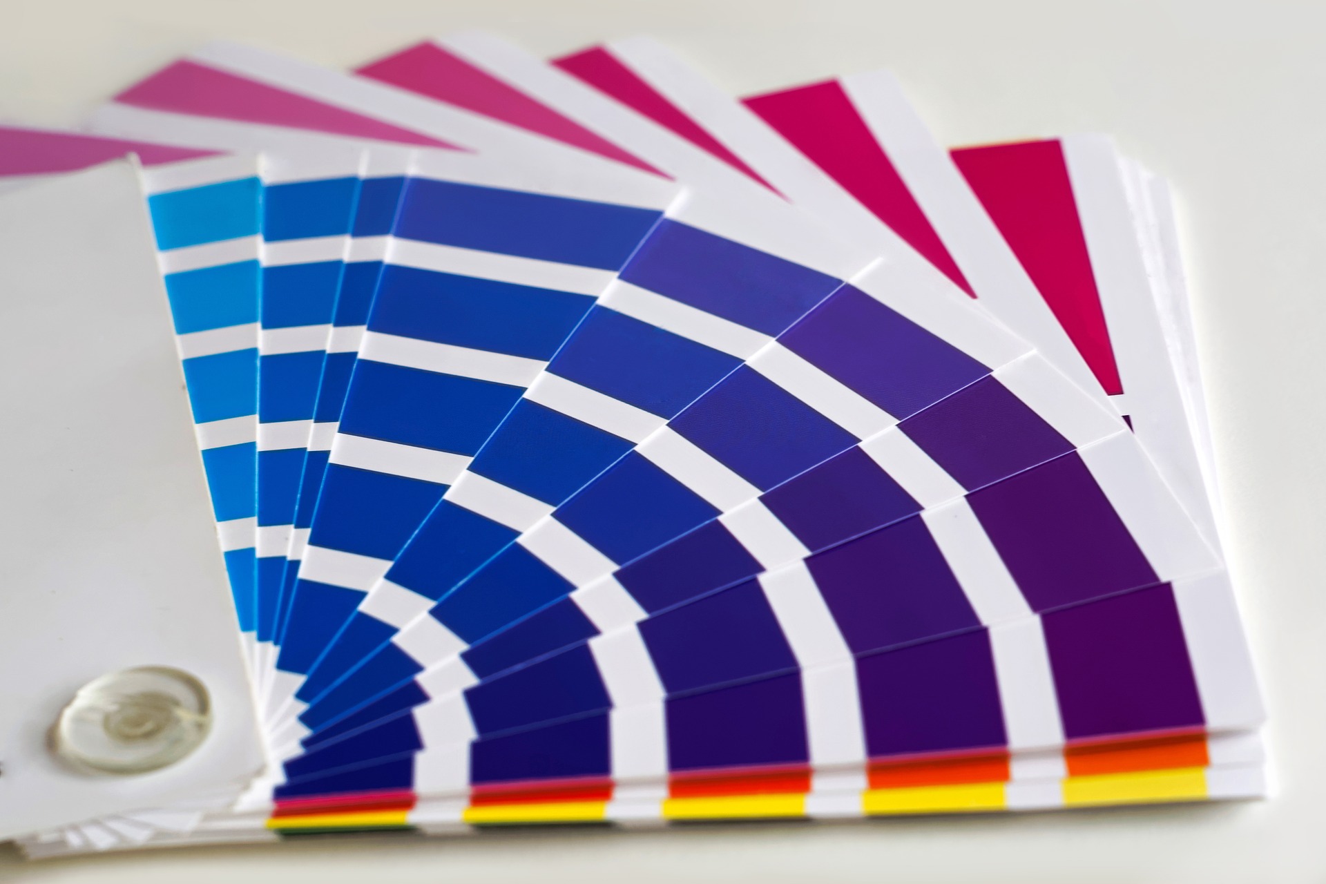
Spot Colors and PMS Matching
It’s common for brands to have a signature color, or for artwork to be printed in limited colors (for example, two plus black). This is where spot colors come in. Single, premixed colors are selected and specified to different elements of the artwork. The most common catalog of spot colors is Pantone® Matching System (PMS). Many printers are able to select a close color with ink they have in stock, or they can mix the perfect shade when it must match specifications (such as a branding style guide).
Full-Color Printing
Full-color art, on the other hand, is printed from a blend of 4 colors: CMYK (cyan, magenta, yellow, and black). This is similar to your desktop inkjet printer, but on a much grander scale. Through blending and gradients, 4-color process printing can achieve photo-realistic printing in full color.
Note that while 4-color process printing uses a color blend of cyan, magenta, yellow, and black (CYMK), digital photos and computer monitors rely on screen colors of red, green, and blue (RGB). While the principle is the same (create the full array of colors from a blend), the outcome is a little different. That’s why screen previews and printouts on desktop printers that use 3 colors instead of 4 might not match the final product. Your professional print company can help with proofing to address any color variances so you can be confident in the finished product.
How to Choose the Right Color Printing for Your Project
With these options, how do you know what is right for your project? Some key questions you might ask yourself:
- Is the project on a tight budget?
- How will this label or graphic be used?
- Do we have a single brand color or a color palette?
- Does the artwork use photorealistic imagery?
Using 1 or 2 spot colors instead of 4-color process can be a cost-saving method. Similarly, using 4-color process instead of a large number of PMS spot colors can also save on costs. Temporary or “disposable” labels or other print items don’t require custom Pantone® blends. Critical branding artwork, however, should use high quality PMS spot colors or 4-color CMYK printing as needed.
Ready to get started with your color label project? Give us a call or contact us!